PRETTY COOL RIGHT? REACH OUT!
VIEW PREVIOUS

VIEW NEXT

We successfully rebranded Krispy Kreme with a fresh revamp. The brand now embodies simplicity and innovation, making it visually appealing to a younger audience.
TAKEAWAY


EFFRA
Primary


ADAM CG.PRO
Secondary
KRISPY GREEN
#007550
HEX
LIME GREEN
#04A033
HEX
KRISPY RED
#CE1041
HEX
WHITE
#FFFFFF
HEX
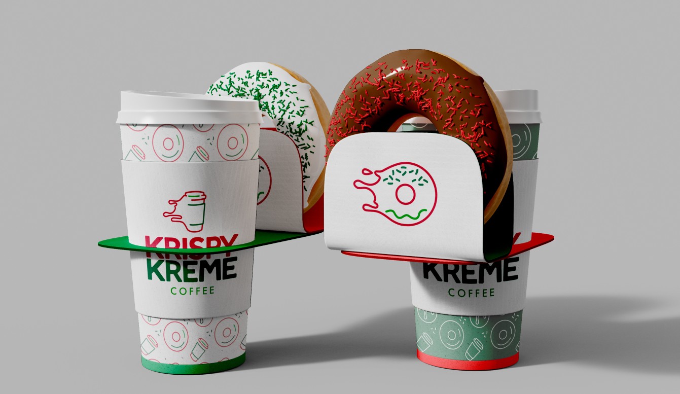
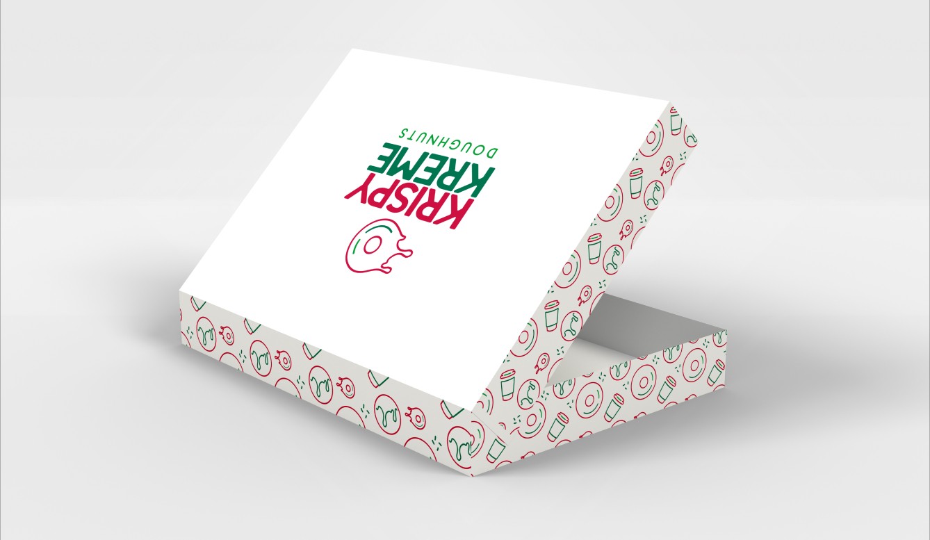
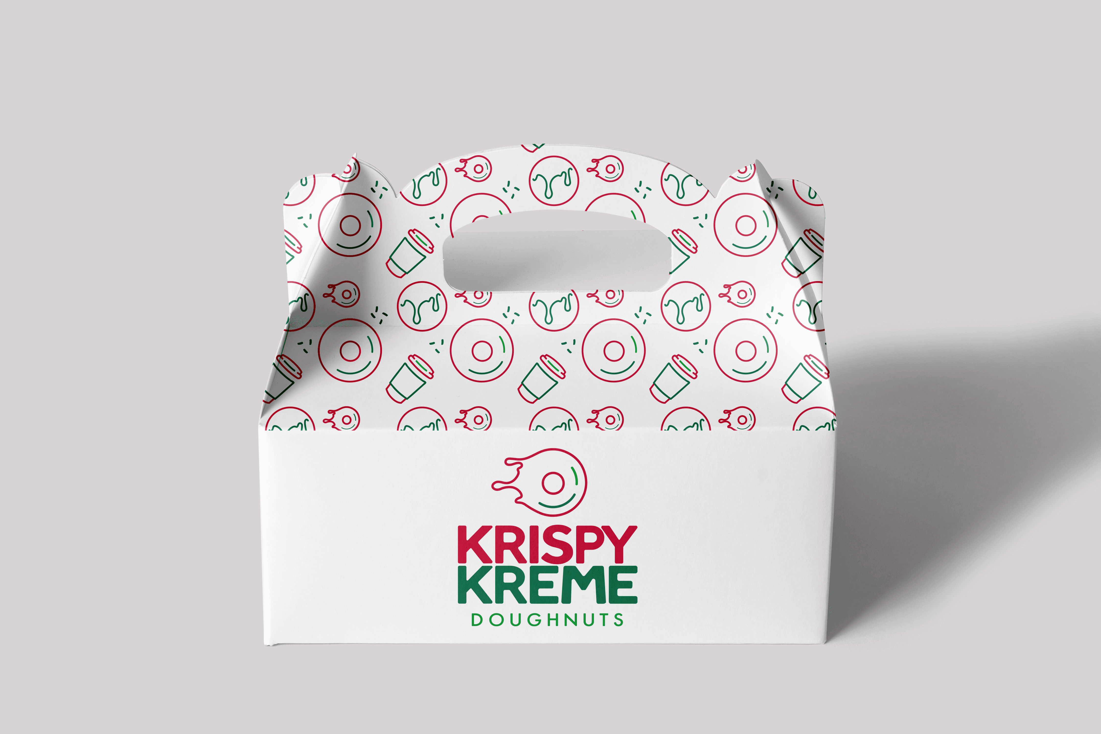
We preserved the brand's original colors for authenticity while incorporating a lime green accent to add a vibrant pop.
BRAND COLORS


“A Hole Lotta Happiness”
NEW TAGLINE
TARGET AUDIENCE
We targeted active commuters across three demographic groups: Corporate Workers, College Students, and Families.
CAREGIVER
70%
30%
CREATOR
BRAND ARCHETYPE
DYNAMIC SYSTEM


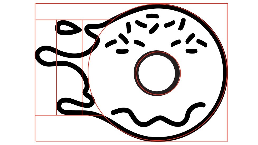
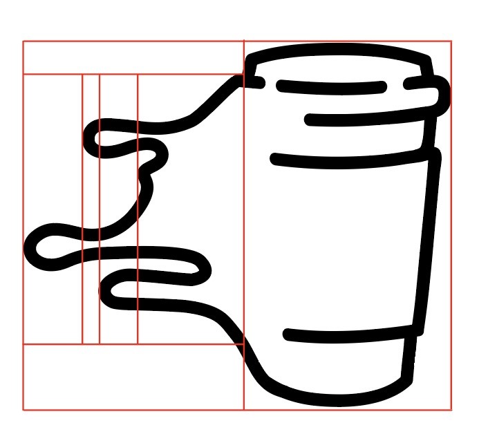
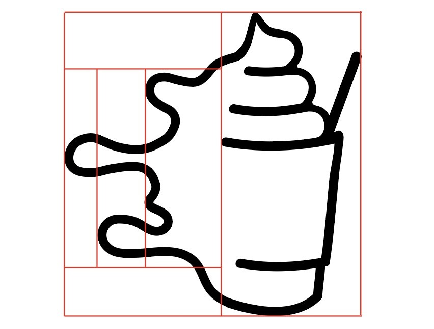
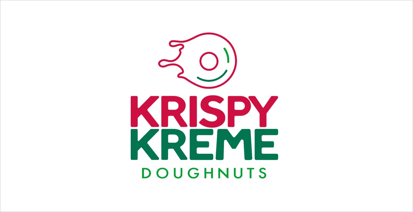
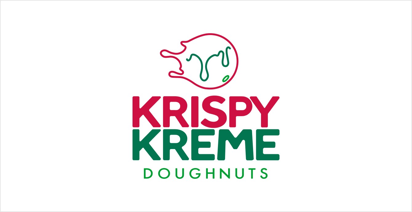
We designed a simple logo that combines both an icon mark and a word mark. It’s thin lines depict a glazed doughnut while symbolizing one of Krispy Kreme's strengths: their quick service.
LOGO DESIGN


BRAND DESIGN
2023
KRISPY KREME
Krispy Kreme, one of the world’s most iconic doughnut franchises, has a classic logo that could benefit from a modern refresh.
PROBLEM
Krispy Kreme's logo is a classic, but it feels somewhat outdated. A refreshed design was needed to resonate with today's target audience.
SOLUTION
We designed a new logo that emphasizes simplicity and modernism, giving Krispy Kreme a fresh and updated look.
TEAM
Ieniyah Green, Nicole Preisel, Redwana Choudhury, Anastasia Anderson
ROLE
Art Direction, Brand Design, Brand Strategy, Logo Design, Animation
TIME
4 months
